What Makes a Website Look Professional?
Have you ever visited a website and immediately felt that the business behind it was trustworthy?
Now think about the opposite. You visit another website, and something feels wrong. The text is difficult to read, the images look outdated, the layout is confusing, or you cannot find the information you need.
You may not know exactly what the problem is, but you already have an impression of the business.
That is the power of website design.
Your website is often one of the first places potential customers visit to learn about your business. Before they contact you, book your service, or make a purchase, they may use your website to decide whether you look credible enough to trust.
But what actually makes a website look professional?
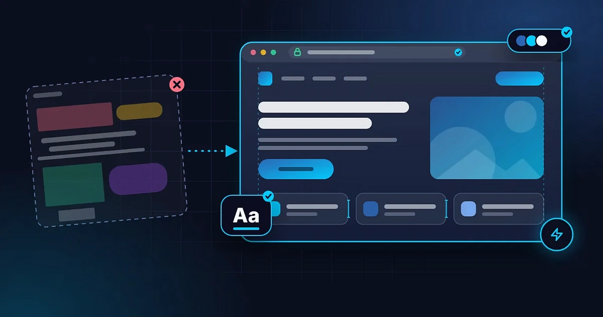
It is not simply about using expensive colours, adding animations, or making everything look fancy. A professional website combines thoughtful design, clear communication, useful content, and a smooth experience.
Here are the things that make the biggest difference.
1. A Clean and Consistent Design
A professional website should feel organised.
When someone visits your website, they should be able to understand the layout without working too hard. Important information should be easy to find, sections should follow a logical order, and the design should feel consistent from one page to another.
A website can look unprofessional when it has too many competing elements, inconsistent colours, random design styles, or unnecessary decorations.
You do not need to fill every available space with something.
Sometimes, leaving enough empty space around text, images, and buttons makes a website look more polished and easier to use.
What to focus on:
- Use a consistent layout across your pages.
- Keep spacing between sections balanced.
- Avoid adding elements that do not serve a clear purpose.
- Make important information stand out.
- Use a design style that fits your business and audience.
A professional design does not need to be complicated. It needs to make sense.
2. Good Typography and Readable Text
Typography is the way text is styled and presented on your website.
It includes the fonts you choose, the size of your headings, the spacing between lines, and how your text is arranged.
These details might seem small, but they affect how people experience your website.
Imagine visiting a law firm's website where the text is tiny, the headings are difficult to distinguish, and every paragraph looks like a wall of text. Even if the firm provides excellent services, the website may not communicate that quality effectively.
A professional website makes reading comfortable.
Use fonts that are easy to read, make headings visibly different from body text, and keep paragraphs short enough to scan.
You should also avoid using too many different fonts. Two complementary typefaces are often enough for a consistent visual identity.
What to focus on:
- Choose readable fonts.
- Use clear heading sizes and hierarchy.
- Make body text comfortable to read on mobile devices.
- Keep paragraphs organised.
- Use bold text selectively to highlight important information.
Your typography should help people understand your message, not distract them from it.
3. Colours That Match Your Brand
Colour influences how people perceive a business.
A financial consultancy, a creative studio, a fashion brand, and a children's school may need different visual approaches because they serve different audiences and communicate different values.
There is no single colour combination that automatically makes a website professional.
What matters is whether the colours work together and suit the identity of the business.
A common mistake is using too many bright colours without a clear system. Another is choosing colours that look attractive individually but make text difficult to read when combined.
A professional website uses colour with purpose.
For example, your primary brand colour might appear in headings, links, or buttons, while a neutral background keeps the content readable. A secondary accent colour can draw attention to important details without overwhelming the page.
What to focus on:
- Choose a small, consistent colour palette.
- Maintain good contrast between text and backgrounds.
- Use button colours consistently.
- Match your website's appearance to your brand identity.
- Avoid decorative colours that make the content harder to read.
Your website should look like it belongs to your business, not like a collection of unrelated design choices.
4. High-Quality Images and Graphics
Images can improve a website, but the wrong images can make it feel less credible.
Blurry photographs, stretched logos, poorly cropped graphics, and unrelated stock images can weaken the overall presentation.
For a business that depends on trust, authentic images can be particularly valuable.
A photographer should showcase their own work. A restaurant can feature its actual food and environment. A consultant might use a professional portrait. A school can present appropriate photographs of its facilities and learning environment.
When original photography is not available, carefully selected stock images can still work. The important thing is to choose visuals that are relevant and consistent with your brand.
Also, image quality is not only about appearance. Large, unoptimised images can slow down your website.
What to focus on:
- Use clear, relevant images.
- Make sure your logo looks sharp.
- Avoid stretching images beyond their intended proportions.
- Optimise image file sizes for faster loading.
- Use consistent image styles across your pages.
- Add alternative text to meaningful images where appropriate.
Your images should support your message and help visitors understand what you offer.
5. Clear and Useful Website Content
A website can have beautiful animations and an impressive layout but still feel unprofessional if the content is confusing.
Visitors should not have to guess what your business does, who you serve, or how they can work with you.
Your homepage should communicate the essentials quickly.
For example, compare these two statements:
"We provide innovative solutions for a better tomorrow."
"We design and build websites for small businesses that want to attract customers online."
The first statement sounds broad but tells the visitor very little. The second explains the service and the intended audience more clearly.
Professional website content is specific, useful, and easy to understand.
Your website should also provide the information people need before deciding to contact you.
Depending on your business, this might include your services, pricing guidance, portfolio, location, operating hours, frequently asked questions, or contact details.
What to focus on:
- Explain what your business does in plain language.
- Make your services easy to understand.
- Write headings that tell visitors what each section covers.
- Check your spelling and grammar.
- Remove unnecessary filler text.
- Keep information accurate and up to date.
Good design attracts attention, but clear content helps people make decisions.
6. Easy Navigation
Imagine visiting a business website because you want to see its services, but you cannot find the services page.
You click through several menus, scroll past unrelated sections, and eventually give up.
That is a navigation problem.
A professional website makes it easy for visitors to move from one section to another. The main menu should contain useful labels, important pages should be accessible, and the overall structure should feel logical.
You do not need to put every page in the main navigation. Too many menu items can make the experience confusing.
Instead, prioritise the pages your visitors are most likely to need.
For many businesses, these include Home, About, Services, Portfolio or Projects, and Contact. The exact structure should depend on what the business offers.
What to focus on:
- Use clear menu labels.
- Keep the main navigation simple.
- Make important pages easy to reach.
- Ensure buttons lead to the correct destinations.
- Include a clear way to contact your business.
- Check that navigation works properly on mobile devices.
Visitors should spend their time learning about your business, not trying to figure out how your website works.
7. A Website That Works Properly on Mobile
Many people discover businesses and browse websites using their smartphones.
If your website looks good on a laptop but becomes difficult to use on a phone, you are creating an unnecessary barrier for potential customers.
Text might become too small, images might overflow the screen, buttons might be difficult to tap, or important sections might appear in the wrong order.
A professional website adapts to different screen sizes.
This is known as responsive web design.
It is not enough for the website to shrink until it fits a smaller screen. The layout and interactions must remain comfortable to use.
What to focus on:
- Make text readable without zooming in.
- Ensure buttons are easy to tap.
- Prevent horizontal scrolling caused by layout problems.
- Resize images appropriately.
- Test menus, forms, and other interactive elements.
- Check important pages on actual mobile devices.
Before publishing a website, review the mobile experience carefully. Your visitors should not need a computer to understand your business.
8. Fast Loading Speed
A website that takes too long to load can frustrate visitors before they even see the content.
Speed is also relevant to search visibility and the overall user experience. However, a fast website alone does not guarantee good rankings or conversions.
Common causes of slow websites include oversized images, unnecessary scripts, excessive animations, poorly configured hosting, and inefficient code.
Adding more features does not automatically make a website better.
Sometimes, removing unnecessary elements creates a faster, cleaner, and more effective experience.
What to focus on:
- Compress and optimise images.
- Avoid unnecessary animations and scripts.
- Use appropriate hosting.
- Reduce avoidable page requests.
- Test important pages using tools such as Google PageSpeed Insights.
- Check performance on mobile connections as well as fast Wi-Fi.
A professional website should not make visitors wait longer than necessary to access important information.
9. Clear Calls to Action
After someone visits your website, what should they do next?
Should they request a quote, book an appointment, purchase a product, download a resource, or contact your team?
If the next step is unclear, visitors may leave without taking action.
A call to action, often called a CTA, guides visitors towards a useful next step.
Examples include:
- Request a Quote
- Book a Consultation
- View Our Projects
- Shop Now
- Contact Us
- Download Our Brochure
The right CTA depends on the purpose of the page.
A professional website does not need a button in every section. It needs clear, relevant actions placed where visitors are likely to need them.
The wording should also be specific. "Get Started" may work in some situations, but "Request a Website Quote" tells visitors exactly what to expect.
What to focus on:
- Give each important page a clear purpose.
- Use action-oriented button text.
- Make buttons visually distinct.
- Link each button to the correct destination.
- Avoid overwhelming visitors with too many competing actions.
A website should not only present information. It should help people take the next step.
10. Trust Signals That Support Your Claims
People want to know whether a business is legitimate and capable of delivering what it promises.
Your website can help answer those questions by presenting relevant, verifiable information.
Depending on your business, useful trust signals might include:
- Real customer testimonials.
- Case studies or completed projects.
- Professional qualifications or relevant certifications.
- Clear contact information.
- A physical business address, where applicable.
- Transparent service descriptions and pricing information.
- Links to genuine professional profiles.
- Clear policies where relevant.
Do not invent testimonials, exaggerate results, or display credentials you do not have. Trust signals only work when they are credible.
A website also needs to function securely. For a site that handles information through forms or payments, appropriate security measures are particularly important.
HTTPS helps protect information exchanged between a visitor's browser and your website, but an SSL certificate alone does not prove that a business is trustworthy.
The goal is to make it easier for visitors to verify who you are and understand what working with you involves.
11. Consistency Across Your Website and Other Platforms
Your website is part of your broader digital identity.
If your business uses one logo on its website, another on social media, and different contact details on Google, potential customers may become confused.
Consistency helps people recognise your business across different platforms.
Your business name, logo, colours, descriptions, and contact information should be aligned wherever possible.
This is particularly important when customers discover you through social media, search engines, online directories, or referrals before visiting your website.
Your website should feel like a natural extension of the business they already know.
What to focus on:
- Use consistent branding across your website and social profiles.
- Keep business contact information accurate.
- Make your service descriptions consistent.
- Use a professional domain name when appropriate.
- Check that links to your other platforms work.
- Keep your website and public business information updated.
A consistent digital identity makes your business easier to recognise and understand.
12. Accessibility and Attention to Detail
A professional website should be usable by as many people as reasonably possible, including visitors who have different visual, motor, or cognitive needs.
Accessibility is not just an extra feature. It is part of building a website that works well for real people.
Small details can make a meaningful difference.
For example, text should have sufficient contrast against its background. Images that communicate important information should have appropriate alternative text. Forms should have clear labels, and interactive elements should be usable with a keyboard.
You should also check the smaller details that can undermine an otherwise polished website.
Broken links, missing images, empty sections, unfinished pages, placeholder text, and inconsistent formatting can make a business appear careless.
Before publishing, check that:
- All important links work.
- Forms submit correctly.
- Contact details are accurate.
- There are no visible placeholder texts.
- Images display properly.
- Headings follow a logical structure.
- Important pages have meaningful titles.
- Visitors can understand and use the main features.
Professionalism is often the result of many small details being handled properly.
13. Search Visibility and Discoverability
A professional website should be built with discoverability in mind.
A beautiful website is not particularly useful if potential customers cannot find it when they search for relevant services.
Search engine optimisation, or SEO, helps search engines understand your website and can improve its chances of appearing for relevant searches.
Important foundations include useful content, descriptive page titles, clear headings, sensible internal links, mobile usability, and technically accessible pages.
Your website should also explain your business in language your potential customers actually use.
For example, a photographer serving Lagos might benefit from pages that clearly describe their photography services and service area, provided the content genuinely reflects what they offer.
You can also structure content to help answer common customer questions. Clear explanations and relevant FAQs can help visitors understand your services and may support visibility across different search experiences, including AI-powered search.
However, no design technique or SEO tactic can guarantee a particular ranking or inclusion in an AI-generated answer.
The aim is to create a website that people can use easily and search systems can understand.
If you want to explore this further, read our guide to Generative Engine Optimization (GEO): How to Optimize Your Website for AI Search.
14. The Website Should Match the Quality of Your Business
This is one of the most important points.
Your website should reflect the kind of experience customers can expect from your business.
If you provide premium consulting services, your website should communicate clarity, confidence, and attention to detail.
If you run a creative business, your website should present your work effectively and make your style easy to understand.
If you operate a school, visitors should be able to find information about admissions, programmes, facilities, and contact details without unnecessary difficulty.
The goal is not to make every website look the same.
The goal is to create the right experience for the right audience.
A professional website is not necessarily the one with the most animations, the biggest budget, or the most complicated design. It is the one that communicates value clearly, supports the needs of its visitors, and works reliably.
Does a Professional Website Have to Be Expensive?
Not necessarily.
A small business can have a professional website without paying for unnecessary features or complicated custom functionality.
What matters is choosing the right scope for your needs and investing in the areas that make a real difference.
A simple website with clear content, consistent branding, responsive design, useful calls to action, and reliable performance can be more effective than a much more expensive website that is difficult to use.
Your budget will influence what can be built, but spending more does not automatically guarantee better results.
Before hiring a developer, be clear about what the website needs to achieve.
Do you need a portfolio to showcase your work? A business website to explain your services? An online store? A landing page for a particular offer?
Understanding your goal makes it easier to choose the right solution.
If you are planning a website for your business, explore our website development services and pricing information.
Final Thoughts
A professional website is the result of more than attractive visuals.
It combines clean design, readable typography, consistent branding, useful content, easy navigation, mobile responsiveness, good performance, clear calls to action, and credible information.
These elements work together to shape how people experience your business online.
You do not need to implement every possible feature at once. Start with the basics, fix the problems that affect your visitors most, and improve the website as your business grows.
Most importantly, remember that your website is not just something people look at. It is a place where they learn about your business, evaluate your credibility, and decide whether to take the next step.
Build it with that experience in mind.
or view our pricing to get started.